Vitals Assist App
Automate vital signs capture and calculating Early Warning Scores to escalate a deteriorating patients.
PRODUCT
An app to be used by nurses on shared tablet devices in a ward setup to capture vitals signs automatically using the bluetooth connected devices. The app calculates the Early Warning Scores of the patients and informs the nurses to escalate the patient care. In case of escalation, a senior doctor can receive a notification on the companion mobile app and can also communicate with staff for any immediate treatments.
MY ROLE
User interviews
Field studies
Co-design workshops
Prototyping
Usability testing & validation


BACKGROUND
While working at Orion Health, I was assigned to a project for collecting patient's vital signs in realtime using wireless devices and calculating the National Early Warning Score to escalate patient care if required. This project was closely aligned with a national programme to reduce the harm caused by failure to respond to acute patient deterioration. This project involved working closely with clinicians to solve the critical piece that is auto-escalation of deteriorating patients based on the National Early Warning Score.
GOAL
The aim was to empower clinicians via cross-platform mobile application that collects vital sign data from wireless devices in real-time to enable faster and efficient clinician responses to changes in vital signs and monitor patients from anywhere, at any time. The app is integrated with medical devices, clinical risk tools and calculators as well as evidence-based knowledge-base, empowering junior doctors and nurses providing them with accurate decision support tools at point of care.


PROCESS
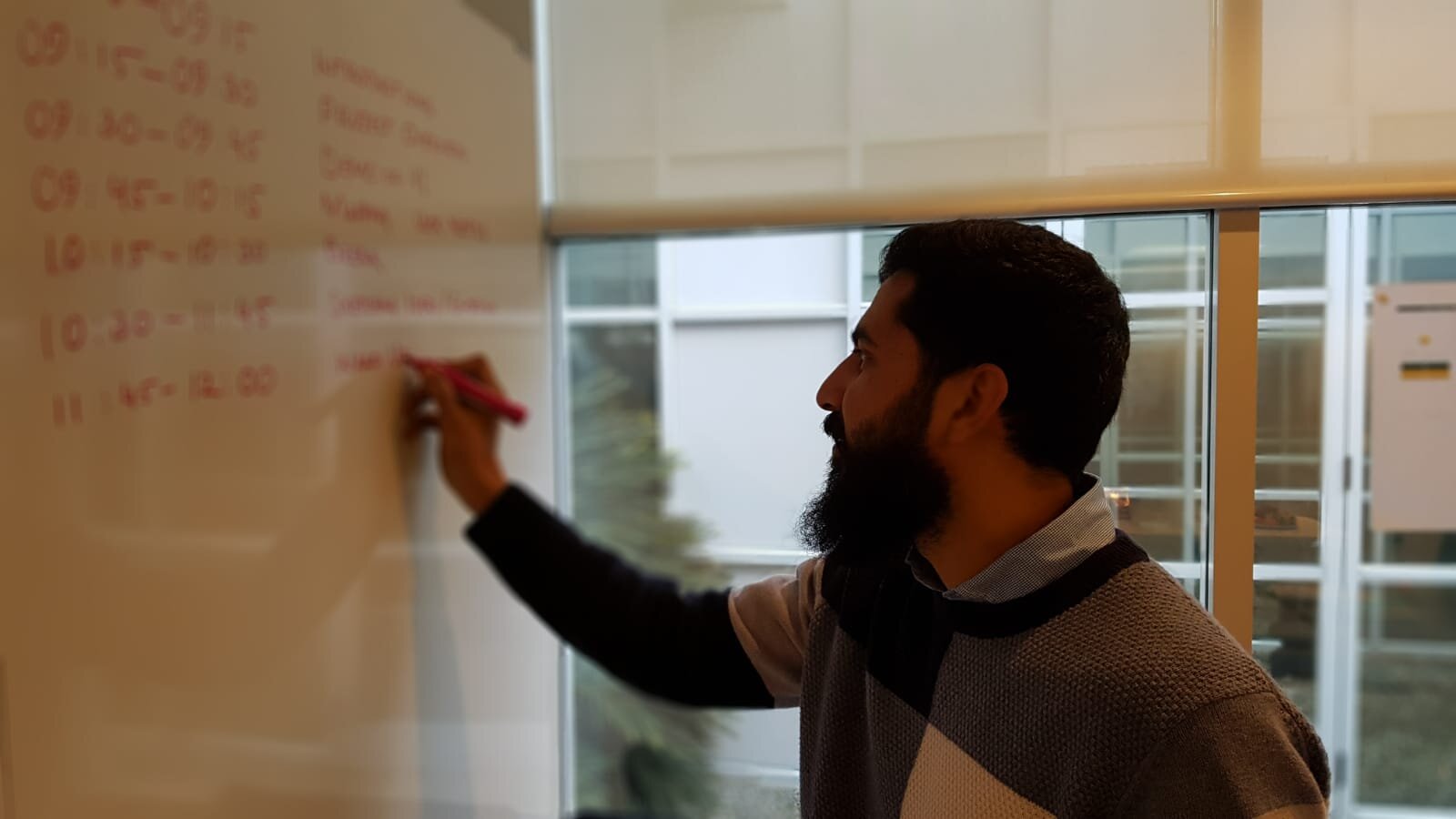
I had 3 months to work on the project from scratch till delivering all the design assets. The project kicked off with the field study where I followed a few nurses in the ward to understand their current process, pain points and needs. Once I was confident that I understood the end user's journey, opportunities as the gaps in their process, I ran a co-design session which was attended by members from different disciplines; doctors, nurses, product team, UX designer, business analyst and a developer. Part of the design session was to map out the user journey and explore and elaborate the needs of the end users which included the ward nurses, junior doctors, responders and senior clinicians. Once the problem statement was defined, Crazy 8 method was used to collect different ideas as solution.
USER FLOW
OPPORTUNITIES
How might we help nurses save time in data entry
How might we help nurses calculate NEWS quickly
HMW educate nurses & junior doctors how to attend a deteriorating patient
IDEATION & VALIDATION
The final ideas (sketches) were taken back to the desk, and I started creating the interactive wireframes to test with the end users. Multiples iterations of the usability test were done to minimise the usability issues and validate the final designs.
Once satisfied with the results, visual design were created for both Android tables and iPads. Part of the whole solution also included a companion mobile app which was targeted for the responders and senior clinicians to get alerts for the escalation requests and respond to it timely. Hence the designs for the companion apps (Android and iOS) were also created.
All the assets were handed over to the development team and after a few months multiple UX reviews were done to make sure the final apps were aligned with the proposed designs.
More details on the project can be found at Precision Driven Health
Thanks for reading.


